I’ve had some feedback regarding Mike Hinge merchandise and it’s clear that amongst the things most wanted is a Mike Hinge book. A worthy tribute to Mike and his art is something that would be very much appreciated and long overdue - a complete omnibus of his work from his early New Zealand work, advertising, published SF works and Kinetic Art. As well it has been suggested a reprint of "The Mike Hinge Experience" or even a "Mike Hinge Experience II" either physical book reprint or a digital publication or even an interactive digital comic application as available on comiXology. Unfortunately though Jane Frank doesn't have any current plans for a book, but has suggested in the email i received at the time of hearing news about merchandise, at sometime a book could be put together. Perhaps if momentum continues we could see it happen sometime soon?
Other merchandise indicated as wanted are T-Shirts, posters and prints.
Another exciting and really interesting proposal was, to create an award in Mike's name that could be presented at a selected SF convention and It was suggested that this could be made possible from some of the profits from the Mike Hinge merchandise. The award could be to recognise new talent or work of excellence in a particular area of graphic art illustration related to science fiction. I think that this could be a really positive way to honour the memory of Mike's work.
Sunday, 28 August 2011
Saturday, 20 August 2011
Mike Hinge News Flash
I have had some amazing news from Jane Frank, (she's the agent for Mike's estate), at Wow-Art. Currently she is in the process of considering to develop a line of Mike Hinge merchandise!!! And has asked for the viewers of Onyxcube what type of merchandise you would buy and also to know what are your favourite Mike Hinge images. I will see about setting up a questionnaire ASAP.


Mike Hinge 121
Thank you again to everyone that contributed towards the Mike Hinge 80th anniversary it was a brilliant experience and I'm still very excited by it all and the feedback from everyone thank you very much. It was really good knowing that Mike was remembered so well and had made such good friends. His popularity then and now will continue to grow.

Mike Hinge -Bionic Hand. Colour photocopy collage. Gloss paper. Approximate size 18x13cm. Date unknown.
From the collection of Mike Hinge photocopies. Above is small colour photocopy of A detail taken from the Six Million Dollar Man centre-spread from Mediascene. The image is reproduced smaller than the actual printed image from mediascene and the colours reproduced are slightly different with a more purple graduation and a glossy look. A pattern (taken from lower down in the actual printed image from mediascene has been pasted where Steve Austin (Six Million Dollar Man) was and two triangular areas have been blackened out with black marker pen. See below for comparison.

For reference to the original art click here. (Thanks Kev).
Tuesday, 9 August 2011
Mike Hinge 80th Anniversary
Today is Mike Hinge's birthday, he would have been 80 years old. To celebrate this date I will be posting Memoirs, short stories, tributes and rare artwork sent to me specially for this occasion by friends of Mike FOM's (put by Sandford) and art from a fellow fan and collector.
List of contributions (which will appear as separate posts*):
*Mike Hinge 80th Anniversary: Matt Howarth
- Unlocking some Hinged Memories by Matt Howarth
- The Domino Afternoon by Matt Howarth (download link)
- Separation Anxiety by Matt Howarth (download link)
*Mike Hinge 80th Anniversary: Sandford Zane Meshkow
- MICHAEL B. (for BARRY) HINGE: A MIND NEVER AT REST bySanford
- A Friend of Max by Sandford Zane Meshkow (download link)
- Mike's actual date of birth
*Mike Hinge 80th Anniversary: Andrew Porter
- Photograph of Mike Hinge with Ted White and Fred Von Bernewitz.
- Mediascene front cover Prelim of Fred Dreyfuss in Close Encounters
- Cover of MEDIASCENE, section two, issue 28, Nov-Dec 1977
- Cover of ALGOL Vol. 12 No. 2, Issue No. 24, Summer 1975
- Cover of Starship Vol. 17 No. 2, Whole No. 38, Spring 1980
*Mike Hinge 80th Anniversary: Alex Jay
- 13th Annual Type Director's Club Show (TDC XIII) of 1967 (including Scans)
- Alphabet Thesaurus Vol. 3, A Treasury of Letter Design by Photo-Lettering Inc., 1971. (including scans)
- The Onyx Group, Design Quarterly 78/79 (including scans)
- Mars One Crew Manual (including scans)
- Photographs of Mike Hinge
*Mike Hinge 80th Anniversary: Roger Hines
- Tribute to Mike Hinge
- The Art Center College of Design...a strong foundation in the "basics"...then to more "edgy"
- Mike Hinge short film collaboration "CITY"
*Mike Hinge 80th Anniversary: Kevin Foakes
- Original cover art of MEDIASCENE, issue 10, May-Jun 1974
- Rough experimental art for the LP Word Jazz by Ken Nordine
*Mike Hinge 80th Anniversary: Mike Hinge
- Unpublished Illustrated story by Mike Hinge
List of contributions (which will appear as separate posts*):
*Mike Hinge 80th Anniversary: Matt Howarth
- Unlocking some Hinged Memories by Matt Howarth
- The Domino Afternoon by Matt Howarth (download link)
- Separation Anxiety by Matt Howarth (download link)
*Mike Hinge 80th Anniversary: Sandford Zane Meshkow
- MICHAEL B. (for BARRY) HINGE: A MIND NEVER AT REST by
- A Friend of Max by Sandford Zane Meshkow (download link)
- Mike's actual date of birth
*Mike Hinge 80th Anniversary: Andrew Porter
- Photograph of Mike Hinge with Ted White and Fred Von Bernewitz.
- Mediascene front cover Prelim of Fred Dreyfuss in Close Encounters
- Cover of MEDIASCENE, section two, issue 28, Nov-Dec 1977
- Cover of ALGOL Vol. 12 No. 2, Issue No. 24, Summer 1975
- Cover of Starship Vol. 17 No. 2, Whole No. 38, Spring 1980
*Mike Hinge 80th Anniversary: Alex Jay
- 13th Annual Type Director's Club Show (TDC XIII) of 1967 (including Scans)
- Alphabet Thesaurus Vol. 3, A Treasury of Letter Design by Photo-Lettering Inc., 1971. (including scans)
- The Onyx Group, Design Quarterly 78/79 (including scans)
- Mars One Crew Manual (including scans)
- Photographs of Mike Hinge
*Mike Hinge 80th Anniversary: Roger Hines
- Tribute to Mike Hinge
- The Art Center College of Design...a strong foundation in the "basics"...then to more "edgy"
- Mike Hinge short film collaboration "CITY"
*Mike Hinge 80th Anniversary: Kevin Foakes
- Original cover art of MEDIASCENE, issue 10, May-Jun 1974
- Rough experimental art for the LP Word Jazz by Ken Nordine
*Mike Hinge 80th Anniversary: Mike Hinge
- Unpublished Illustrated story by Mike Hinge
Mike Hinge 80th Anniversary: Matt Howarth
Matt is a writer/artist and met Mike Hinge in the early 70's and has written a personal Memoir for Mike remembering his taste in music and particular aspects of his working practice as well writing a short SF story "Domino Afternoons" inspired by the sad experience of clearing Mike's apartment after his passing and a link to a SF novel "Separation Anxiety" in which many scenes he wrote were inspired by Mike's art.
See Matt's work here:
http://www.matthowarth.com/
Unlocking some Hinged Memories
by Matt Howarth 7/2011
See Matt's work here:
http://www.matthowarth.com/
Unlocking some Hinged Memories
by Matt Howarth 7/2011
I was a kid the first time I met Mike Hinge. It was at a Philcon (the Philadelphia Science Fiction Convention) in the early 70s; I was a fanboy and he had a table in the Art Show where he was displaying his art and selling his posters. I was familiar with Mike's art (from SF magazines and book covers) and wanted to show him my own (admittedly primitive at the time) art. He proceeded to (verbally) tear my work to shreds, heaping garrulous criticism on my formative art, probably in an attempt to get this fanboy to move along. Unknown to him, though, I was not insulted by his critique; I took his comments to heart and went off to apply his remarks to bettering my art. Much of my sense of design originates from his advice, and I consider him one of my mentors (although he would later rigorously deny that honor, not remembering our first encounter at all).
The next time our paths crossed, years later at some other SF convention, it was our common tastes in eccentric music that brought us together and cemented a solid kinship that would last to (and beyond) Mike's untimely passing.
While Mike's tastes were widespread (running the gamut from electronica to reggae to pop to swing bands), my interests tended to focus on electronic music, with strong concentration on the European scene in the 70s. Consequently, he would often pick my brain regarding what was happening in that scene. Mike was a data junkie, and would jot down a lot of my comments on file cards during our discussions for later reference use. Back and forth over the years, we turned each other on to a variety of bands.
At some point (circa early 80s) Mike was staying at Neal Adams' Continuity Studios in NYC, where he had a niche for his drafting table and boxes of stuff and a ratty mattress shoved in a corner. I remember visiting him there one evening and we spent hours swapping sonic tales. While I had a strong interest in his art (his strong command of stylization shows heavily in my own mature art), the gist of our conversations usually concentrated on music. He would get very excited when I'd tell him about…say, the latest album by Ultravox, for his finances were never opulent, forcing him to appreciate a lot of stuff secondhand. In turn, he would dazzle me with discoveries he'd made scouring the discount bins of Manhattan record shops. That night at Continuity Studios, he pulled out one record and turned me on to Canadian rocker Nash the Slash (with whom I would, years later, form a deep and lasting friendship, working with Nash on several projects…but that's another memoir).
Over the years Mike and I fell in and out of touch, but inevitably the Great Magnet would bring us back together. I spent a lot of the 80s hanging out in NYC, seeing a variety of concerts--and ran into Mike at many of these gigs. We would catch up on each other's doings, but invariably the topic of our discussions would devolve to music…and endure for hours.
Years later, when Mike moved into Philadelphia, he would call every once in a while, to check in and chat…but what he really wanted was to be updated on whatever new music I had discovered. "This is silly," I would tell him. "Why are we wasting time talking about music when you could come over and visit--and actually hear some of this stuff?" But Mike was a recluse and would always beg off visiting for some dubious reason, leaving our exchanges limited to discussions about music. On a few occasions I recorded certain albums for him and sent him the tapes--this thrilled him. He was especially grateful for a live Can album I gave him one time; he really loved Can.
Other bands that Mike enjoyed included: Magazine, Klaus Schulze, the Human League, Japan, Neu, Fad Gadget, OMD, XTC, Ornette Coleman, Led Zeppelin…oh, the list could go on and on. He had a REALLY big collection of music. He also had a lot of 60s Californian psychedelic rock (like Moby Grape). His tastes seemed to focus on experimentation; he was attracted to musicians who pushed the envelope and broke the rules to discover new sonic ground.
It was only after his passing that I actually got the opportunity to see that collection, when I helped his friend Sandford Meschkow to empty out Mike's cramped apartment. As a diehard audiophile, I refused to allow that collection to end up in the hands of the Salvation Army or in a dumpster. I felt it only proper that his collection be disseminated among his friends who shared his tastes. It took a long time--it was a vast mass--but I feel I succeeded in doing the right thing. (I ended up keeping very little of his records for myself, only because I already had most of the stuff I would've wanted.)
During those post-mortem days, I also assisted in the gathering and organization of Mike's artwork (which was stored in the hands of a variety of his friends) to be handed over to an art agent for sale. At this time I got the chance to view his artist career in its entirety (for Mike was a packrat and never threw anything away). His range was incredible. While he is remembered mostly for his highly stylized SF art, he was an accomplished commercial artist possessing the adept skill of adapting his work to whatever style required by the job at hand. He designed several type faces, and built a few constructions that can only be described as futuristic machines with no more function than to be bewitching to the eye. He'd done numerous paintings, much to my surprise, since I was mainly familiar with his linear work. He worked big, often covering a wall with a sheet of paper on which he would do rough designs which would later be converted to smaller canvases. He kept a vast reference library, consisting of not just books but clipped pictures from magazines, all sorted by topic and stored in folders in plastic bags (to protect them from entropy). He had a sincere fascination for colorful lifeforms, like tropical fish (probably stemming from his youth in New Zealand).
At that point I found myself with a newborn respect for his talent…and a sadness that I would never get the chance to tell him about it. But then, I suspect Mike would've just waved a hand and dismissed my praise, muttering something about doing what was necessary to make it as an artist in the modern world…then he would pull a wad of index cards from his pocket and start interrogating me about what new music I'd found.
--------------------------------------------------------------------------------------------------
Aside 1: As a workaholic, I'm constantly producing stories (graphic and prose). While the majority of my work is science fiction, sometimes inspiration comes from real life. My short prose story "Domino Afternoons" is one such, stemming from the experience of helping to clear out Mike Hinge's crowded apartment after his demise.
(Read Matt's story here:
(Read Matt's story here:
Aside 2: Being exposed to Mike Hinge's art en masse during posthumous sorting provided me with another such wealth of inspiration. There was a plethora of tantalizing imagery, for Mike's mind was a fertile one. I ended up writing an entire SF novel ("Separation Anxiety") in which many scenes were inspired by Mike's art. As one might expect, robots play a key role in the tale. Interested parties can check out the novel at: www.bugtownmall.com/New_Matt_Howarth_Stuff.htm
Mike Hinge 80th Anniversary : Sanford Zane Meschkow
Sandford is a writer and editor and met Mike Hinge in the mid 60's and has written a personal memoir for Mike remembering certain art projects and the materials and practices he used as well writing a short SF story "A Friend of Max". As well a clarification of Mikes actual date of birth.
See some of Sandford's early SF writing here:
http://www.isfdb.org/cgi-bin/ch.cgi?14512
MICHAEL B. (for BARRY) HINGE: A MIND NEVER AT REST
See some of Sandford's early SF writing here:
http://www.isfdb.org/cgi-bin/ch.cgi?14512
MICHAEL B. (for BARRY) HINGE: A MIND NEVER AT REST
By Sanford
When I first joined science fiction fandom back in the 1960s, authors always seemed to be writing essays in fan publications about being cornered by fans asking them where they got their ideas. Knowing Mike for 36 years, I soon learned where he got his ideas: EVERYWHERE! The artistic potential of all sorts of objects seemed to fascinate him.
When several Philadelphia New York
Founded in 1923, Barney’s once was a landmark New York 7th Avenue 17th Street
That street mural? It was an eye-catching arrangement of representations of manhole covers in a contrasting color on a black background. There were easily a dozen different manhole cover designs represented. Who but Mike Hinge could have conceived of making art out of manhole covers? Yes, if you wanted an illustration of a New York street
Mike was fascinated by found objects. He collected everything from cigarette packs to, well, money. The U.S. coins he spent, of course, but it astounded us how many coins from Canada , France , and Caribbean and South American countries he had picked up from the street over the years. He had also accumulated a vast collection of bits and stuff for a planned giant collage which, sadly, had to be discarded after he died.
What media did Mike work in? Illustrators and designers used to do rough comps with marker pens. We found a huge set of Berol® PRISMACOLOR ® professional-quality markers that must have included over 100 colors, plus many shades of grey. He had replaced the markers in the original set with newer certified non-toxic markers as he used the old ones up. We would have liked to have donated it, except the oldest markers were so old that the pigments were in solution in some smelly hydrocarbon (benzene? toluene?) that we feared were probably pretty toxic. Working with them in a small room might have made Mike dizzy, but what he would have like about them was their ease of use and their vivid colors. He also liked to use Pelican Plaka casein emulsion paints from Germany
Mike lived with my wife and I for about 14 months and in return he offered to paint our house – if he could pick the colors. Think of a staid suburban street with one incandescent painted lady of a house on it! We said no, but gently.
Mike liked to work large; the poster was a natural size for him. Also, his big preliminary sketches were as tight and as near completion as some other artist’s final versions. One of his works lost in various moves was a room-sized mural with a historical New Zealand
Yes, let’s talk of lost art and lost opportunities. Mike told us once that he had decided not to marry because he could never be sure of being able to support a family. He never seemed to have considered the possibility of finding and marrying a woman who worked outside of the home and who might have been capable of providing some cash as well as company during those lean times when art jobs are far apart. Marriage to a creative person can be a rocky road and the Mike I knew would have made a difficult husband, but marriage to the Mike I never knew, the one married to a women who made him happy and could have steered him in the right direction when he needed it – well, that would have been another story. How many covers for ANALOG and TIME might he have done then?
Had Mike been a more famous artist, less of his work would have been lost in moves or dumped when he couldn’t pay storage bills. To pay his taxes and convert some of his belongings to cash for his brother, we filled a van with his paintings and some of his commercial work and sent them off to be auctioned. We were told what not to include. Not his kinetic sculpture, no Parsec City posters, rough sketches, doodles, stats or machine copies of works, nothing of the type of thing that would have had auction value if Mike had been as famous at his death as, say, Jack Kirby. Local friends and fans and I saved some of that unwanted stuff from going into the recycle bin. A lot of that appears on this blog thanks to Ivan. And there is still more out there, so don’t give up, Friends of Mike (FOMs) and inhabitants of Parsec City
-----------------------------------------------------------------------------------------------
Aside 1: Copy of an email I received from Sandy Meschkow and a Mike Hinge inspired story:
A Friend of Max.
Read Sandy's story here: http://onyxcube.weebly.com/
-----------------------------------------------------------------------------------------------
Aside 1: Copy of an email I received from Sandy Meschkow and a Mike Hinge inspired story:
A Friend of Max.
Dear Ivan,
I thought the fans of your site might enjoy another bit of fan fiction inspired by Mike Hinge. Mike was no mad scientist, although his electronic sculptures were really something! And he could have made more money during his later years if he were socially adept enough to work with art galleries and smooze more. But he was pretty much a loner and both essentially shy and uncompromising – a bad combination in a field where self-promotion is essential. Mike’s actual apartment is well-described in this story and Mike did have a few friends that kept him going in his later years when the number of science fiction magazines dwindled and the rise of computer graphics cut the ground out from under many established illustrators working in the commercial art field. And if Mike had invented a time machine, it surely would have turned out to have something wrong with it, because he seemed plagued by bad luck.
Sandy Meschkow
Aside 2: A contribution by Sandy Meschkow regarding Mike's actual birth date.
Mike’s date of birth actually was August 9, 1931. The exact date of his death is uncertain, but it was probably only a few days or two from his birthday in 2003. I still have a big file of letters and stuff about Mike, so it will be no problem to come up with something interesting to say.
Here’s one thing; some sources may say that Mike was born in 1937, and here’s why. When Mike went through the U.S. immigration process, he presented adequate paperwork to establish his date of birth, but in the English (or Continental?) fashion the “1” at the end of his year of birth had a slash through it, so the clerk read it as a “7”. Mike never bothered to go through the hassle of changing it when he was young. But in his last few years he could have really used those extra years of Social Security that he had been cheated out of by a clerical error. We were furious with him when we found out that he had not taken care of that!! Here was a guy who was known as Captain Copyright for enlightening other artists about their rights and got into hot water with some sleazy publishers by not allowing them to swipe his rights and artwork, but was so intimidated by the U.S. Immigration Service and Social Security Administration that he didn’t dare try to get his date of birth corrected. It’s really sad! We helped him sign up for Social Security and you could tell he was sweating bullets through the whole process.
Sandy Meschkow
Mike Hinge 80th Anniversary: Andrew Porter
Andrew Porter first met Mike Hinge in the early 1960s, when he moved to NYC from Los Angeles, where he'd been a student at the Art Center School [now College] of Design. Andrew Porter was the editor and publisher of ALGOL, The Magazine About Science Fiction.
For the 80th Anniversary blog posts, Andrew has contributed a photograph of Mike, some covers from Algol and Starship and a rare prelim for the cover of Mediascene of Richard Dreyfuss in the film "Close Encounters of the Third Kind".
Andrew recalls that this cover was designed so that there were over-runs done without the logo which when folded made great Christmas cards.
For the 80th Anniversary blog posts, Andrew has contributed a photograph of Mike, some covers from Algol and Starship and a rare prelim for the cover of Mediascene of Richard Dreyfuss in the film "Close Encounters of the Third Kind".
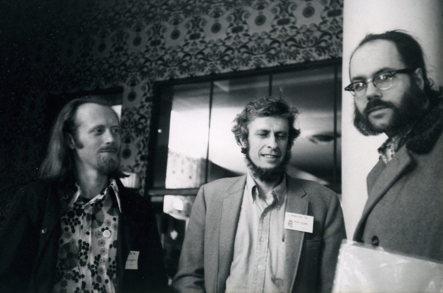 |
| (L-R) Fred Von Bernewitz, Mike Hinge and Ted White, (1971 Lunacon possibly). Photograph by and © Andrew Porter |
 |
| Rough of the cover for MEDIASCENE, The America New Magazine of Popular Entertainment, 1977 |
 |
| Cover of MEDIASCENE, section two, issue 28, Nov-Dec 1977 |
 |
| ALGOL: THE MAGAZINE ABOUT SCIENCE FICTION, Vol. 12 No. 2, Issue No. 24, Summer 1975 |
 |
| Starship, The Magazine about Science Fiction (formerly ALGOL), Vol. 17 No. 2, Whole No. 38, Spring 1980 |
Mike Hinge 80th Anniversary: Alex Jay
Below is an edited version of e-mails exchanged between Alex Jay and myself. Alex is an artist and was a friend and colleague of Mike Hinge and kindly shared with me some interesting facts and images which shed some light into the breadth of Mike's creative work.
http://comicbookdb.com/creator.php?ID=6724
-----------------------------------------------------------------------------------------------------------
New York City
Mexico


------
From: Alex Jay


http://comicbookdb.com/creator.php?ID=6724
-----------------------------------------------------------------------------------------------------------
From: Alex Jay
Sent: 27 July 2011 13:53
To: Ivan Richards
Subject: Mike Hinge Blog
Sent: 27 July 2011 13:53
To: Ivan Richards
Subject: Mike Hinge Blog
Hello Ivan,
Sandy Meschkow told me about your blog and sent your email address to me.
I've known Mike since 1978 when I met him at Neal Adams' studio, Continuity Associates, in
was graphic design so we had a lot in common. I also did a fair number of comic book logos
which can be seen at the Comic Book Database, comicbookdb.com/creator.php?ID=6724; click
on the link for Machine Man and you'll see where Mike's Monkey Wrench typeface came from.
I'll say more about it in another email.
Thank you for creating a blog about Mike and his designs. Most of it I've never seen because
he had it in storage. Regarding your post #119, I can show you Mike's designs from the 13th
Annual Type Director's Club Show (TDC XIII) of 1967; they were part of the ad campaign for


Annual TDC XIII Mike Hinge's winning ad for Mexico Magnifico
On Thu, Jul 28, 2011 at 7:15 AM, Ivan Richards wrote:
All the very bestIvan
------
From: Alex Jay
Sent: 28 July 2011 19:48
To: Ivan Richards
Subject: Re: Mike Hinge Blog
Sent: 28 July 2011 19:48
To: Ivan Richards
Subject: Re: Mike Hinge Blog
Hello Ivan,
Here are the samples of Mike's typefaces from the Alphabet Thesaurus Vol. 3, A Treasury of Letter Design by Photo-Lettering Inc., 1971.
The typefaces were identified by name and number; the number was followed by a letter.
n = normal
c = compressed (stretched north and south)
e = expanded (stretched east and west)
Most were shown in italic at a 12 degree forward slant; a few had an outline sample.
Do you have the book, The Mars One Crew Manual? It was published here by Ballantine
Books in 1985. I designed it and hired Mike to do some technical drawings; the art credits
are on the copyright page. He also designed the patch on the cover; the art was by
another artist. If you can't find it, I might have an extra copy in my basement.
Onyx was represented in the periodical Design Quarterly. It's also in the basement.
Did Mike get a wage increase for his work in TDC XIII? I doubt it because his firm paid the
entry fee, and the hanging fee for the exhibition. Most likely he got a pat on the back, a
hearty congratulations and a copy of the award certificate.
Best,
Alex


On Mon, Aug 1, 2011 at 9:26 AM, Ivan Richards wrote:
------
Sent: 01 August 2011 20:08
To: Ivan Richards
Subject: Re: Mike Hinge Blog - thank you
Hi Ivan,
Attached is a scan of the cover of "Design Quarterly 78/79: A Special Double Issue on 'Conceptual Architecture'"; near the top of the cover, the letter is addressed to Onyx and others; near the bottom you'll see "ONYX (pages 42-46).
On page 44 Mike was represented by his Parsec City Parsec City
In the next email, I'll write more about the Mars One Crew Manual and related graphics.
Best,
Alex


From: Ivan Richards
Subject: Re: Mike Hinge Blog - Onyx group
To: Alex Jay
Date: Tuesday, 2 August, 2011, 13:20
Hi Alex,
Thank you very much, this Onyx group is very interesting. It is the first I have heard of it. Initially I thought you meant that Onyx was a typeface as I have a letterhead in my collection that has ONYX in an unusual green font and then a New York
(...)
All the best
Ivan.
------
From: Alex Jay [mailto:alexjay10@gmail.com]
Sent: 02 August 2011 03:18
To: Ivan Richards
Subject: Mars One
To: Ivan Richards
Subject: Mars One
Hi Ivan,
As I mentioned in an earlier email, Mike designed the Mars One patch which was rendered by another illustrator.
Attached are the alternate patch designs plus unused logos. Many of the logos were influenced by other fonts,
which he incorporated into the name. There were some exciting-looking logos but the editor and marketing head
at Ballantine Books wanted the cover to have some resemblance to the Space Shuttle book which was by the
same author. The Ballantine art director made the font selection for the cover.
The author supplied the technical drawings and most were used, as is, in the book. (There is a full-page photo
of the author, dressed in uniform, in the book. I cut out a press-proof of the patch and taped it to his uniform.) In
some cases the drawings needed to be modified and there's where Mike came in. I'd explain to Mike what the
author wanted in the new drawing and then we would go over the reference material and discuss what to do. He
took the material and returned in a few days or so with the finished illustrations. This was done over a period of
about four weeks.
I have a few photos of Mike, from November 2002, to share with you in the next email.
Best,
Alex


From: Ivan Richards
Sent: 03 August 2011 13:21
To: Alex Jay
Subject: Re: FW: Mars One
Sent: 03 August 2011 13:21
To: Alex Jay
Subject: Re: FW: Mars One
Hi Alex
Thank you very much, I wanted to first re look at my copy of Mars One, before replying. I had a good look again last night and have the copy here with me. It is such a clearly laid out book and with excellent notes crediting the art work. It has some great technical drawing from Mike (and you) with the occasional noticible Hinge style. With all the technical detail it might have been a joy for mike to do, there's a nice illo of a communication station 2.5.1 that has some buttons which he's used in other illustrations which is a nice continuity. The main computer console 6.1.1 looks amazing. Understandably the project didn't call for stylised drawings pity as i think it would be even more stunning. The drawings are they drawn large do the originals still exist?(...)
(...)
I look forward very much to seeing the photos of Mike.
All the very best
Ivan.
------
From: Alex Jay
Date: Thu, Aug 4, 2011 at 1:49 AM
Subject: Re: FW: Mars One
To: Ivan Richards
Hi Ivan,
Photostats were made of Mike's original art. These photostats or line positives were pasted, along with the photo-typesetting of the text, on the mechanical. (These are terms from the pre-didgital age.) The original art was returned to Mike who always made a point of getting his art returned. I assume Mike stored the Mars One art with his other art. On this project I believe he did a few alternate drawings.
Back in November 2002, I invited Mike to spend the Thanksgiving weekend with my family, in-laws and my wife's relatives. I hadn't seen him for a few years so it was good to see him again. Actually, the last time I saw him was at my wedding back in 1994. The next day we travelled around the city; he always loved New York City World Financial Center which was across the street from what was the World Trade Center Trade Center World Trade Center Trade Center East Village
The other group of photos were shot at the 42nd Street
(...) From the subway we walked to the street level and on to the bus station.
At the bus station we said our good-byes and that was the last time I saw him. Later, we talked a few times on the phone; one conversation was about a portrait he was working on of my wife. Then, in August 2003 I got a call from Larry Hama, who got a message from Jim Steranko, who was notified by Sandy Meschkow, about Mike's sudden passing.
Lastly, regarding the ONYX letterhead, I don't know if it was for Mike or the group. Mike told me he lived in the Chelsea neighbourhood which is on the west side of Manhattan
Hope you enjoy the photos.
Best,
Alex


Mike Hinge 80th Anniversary: Roger Hines
Below is an edited version of e-mails exchanged between Roger Hines and myself. Roger is an assemblage artist and met Mike Hinge at Art College in the 60's and has kindly shared his reminiscent stories which bring wonderful insights into Mike's early work in advertising and experimental art.
See Roger's artwork here: http://www.mindspring.com/~rogerhines/
------------------------------------------------------------------------------------------------------------
See Roger's artwork here: http://www.mindspring.com/~rogerhines/
------------------------------------------------------------------------------------------------------------
From: Roger Hines
Sent: 28 July 2011 22:59
To: Ivan Richards
Subject: TRIBUTE TO MIKE HINGE
Sent: 28 July 2011 22:59
To: Ivan Richards
Subject: TRIBUTE TO MIKE HINGE
I first met Mike in 1965 when we were attending The Art Center College of Design in Los Angeles. We also resided at the same boarding house that was run by my aunt. It was then that I became aware of Mike's fantastic work. It really inspired and influenced me as I was just beginning my art and design career. Back then, Mike was waaaaay ahead of his time. His endless child-like curiosity about everything greatly shaped his work...and others too.
Mike was a true eccentric. Really danced to his own tune. Difficult at times but he never lost his integrity. He never stopped reaching ever further into everything he touched and created.
Integrity, energy, passion, curiosity, inquiring, talented, foresighted, innocent... are but a few of the words that remind me of Mike.
Mike, Where the hell are you?...now that we REALLY need you!
------
From: Ivan Richards
Sent: Jul 29, 2011 9:02 AM
To: Roger Hines
Subject: Re: TRIBUTE TO MIKE HINGE
Hi Roger
Thank you for your email it's great to hear from you. I'm so pleased to be hearing from friends of Mike or FOMs (as Sandy
You met Mike very early on I would be facinated to hear about the teaching of The Art Center College of Design. Apparently Mike choose the college specially when in New Zealand
Your Aunt's boarding house might have been a fun place to be, i can't help thinking of your rooms of the mind! I guess you had some good nights out and interesting conversations. Mike would have been a little older than you but still young, do you remember seeing any bands with him around about that time and art shows. I have a feeling that Mike was interested in a lot of things and would have made use of that "energy, passion and curiosity" I get the impression that he had a wide interest in art and would have liked had been more involved in the fine art world as well as being an illustrator, I haven't seen any of his kinetic sculptures but I'd really hope to see one or two one day and know more about the work he did for E.A.T (experiments in art and technology). As well I know he collaborated in at least a couple of short art films. I am encouraged by your description of Mike I think he is an interesting character even though having never met him.
I notice [from your website] that you were one of the "Mad Men", do you watch the tv series? Was it like that? Did you work with Mike at that time? Apparently he worked in an ad agency in Los Angeles (I don't know which one) and he was also an art director in New york
If it's okay i'd like to include your tribute on my blog, for Mike's 80th birthday (August 9th).
All the very best
Ivan
------
From: Roger Hines
Sent: 31 July 2011 06:38
To: Ivan Richards
Subject: Re: TRIBUTE TO MIKE HINGE
Sent: 31 July 2011 06:38
To: Ivan Richards
Subject: Re: TRIBUTE TO MIKE HINGE
Just who had influence on Mike at Art Center...I don't know. We were at ACS at different times. Art Center emphasized a strong foundation in the "basics"...then to more "edgy". By then, you were really equipped to pushed to your limit.
Mike and I shared an apartment in Los Angeles for about a year or two. At the time, He was working as an art Director for the May Co., a large west coast retail chain store and another smaller agency I don't recall now.. I was just finishing up graduating Art Center. We never went out to hear bands but Mike had an amazing, vast music collection. A lot of it way out experimental electronica. One group in particular was a group from Germany...Musik Koncret from 1947. WOW! talk about ahead of it's time! He would be working on some of his stuff while I worked on homework assignments way into the night...listening to all kinds of music from his collections....AWESOME FUN!
Mike did a couple of kinetic sculptures which were pretty cool. Whatever happened to them, I don't know. However, Mike was more of an illustrator than a fine artist, although he did have some aspirations in that direction. He mostly did illustrations to make a living. Some bordered on "fine art". He and I collaborated on a short film once, but it never reached completion.
The Mad Men series was fairly accurate. They were wild times. By around 1967, Mike and I were working in New York for Young and Rubicam. I worked in General advertising. Mike in point of purchase/sales promotion. He gave the look to the "Mexico Magnifico" campaign which you have a couple of images for.
Hope this helps. Stay close.
Peace and Light
Roger
------
From: Ivan Richards
Sent: Aug 1, 2011 8:27 AM
To: Roger Hines
Subject: Re: TRIBUTE TO MIKE HINGE
Hi, Roger
I'm so in awe that you and Mike had jobs as Art Directors in the 60's so amazing, thanks to Mad men I can imagine what it might have been like. I guess that all the work produced at these ad agencies wasn't allowed to be taken out of the office and taken home for the portfolio or was it less strict? Would you and Mike have kept a portfolio of published ads? Do you remember any particular clients and ads that Mike did? (...)
Thanks for pointing out that he was the ad director at May Co, i really wasn't sure if it was an outside agency or in house.
What are the differences between General advertising and point of purchase/sales promotion? Did Mike do any tv commercials?
(...)
(...), I had been hoping one day to know more about the short film's Mike worked on. Even though not complete does any footage survive of this film? Is this filmed on 16mm color film? Was it called "City"? What did you and Mike do on this film? What was it about? I would love to see this film, I'm really hoping it still exists.
All the best
Peace and light
Ivan
------
From: Roger Hines
Sent: 02 August 2011 23:14
To: Ivan Richards
Subject: Re: TRIBUTE TO MIKE HINGE
To: Ivan Richards
Subject: Re: TRIBUTE TO MIKE HINGE
When we worked for those ad agencies, we always had plenty of reprints of our work including commercials. Mike did a lot of work for Eastern Airlines when they developed the promotion "Mexico Magnifico". He did the typographic illustrations for that.
The difference between general advertising and "POP" was, general mostly consisted of TV, print ads, radio, etc. "POP" consisted of things like counter cards and displays for merchandise, kiosks, in store merchandising promotions, etc.
I'm surprised you knew about the short film Mike and I started "CITY". How did you know about that? It was never completed because Young and Rubicam transferred me to Germany. It was an animated stop motion short depicting a city building up out of brightly colored abstract shapes and blocks with wild graphics which Mike rendered. I have no way of knowing where the footage is. I believed I turned all of that over to mike. However, there is a real remote chance I may have some it stored away. (...)
Roger
Subscribe to:
Posts (Atom)