Below is an edited version of e-mails exchanged between Alex Jay and myself. Alex is an artist and was a friend and colleague of Mike Hinge and kindly shared with me some interesting facts and images which shed some light into the breadth of Mike's creative work.
http://comicbookdb.com/creator.php?ID=6724
-----------------------------------------------------------------------------------------------------------
From: Alex Jay
Sent: 27 July 2011 13:53
To: Ivan Richards
Subject: Mike Hinge Blog
Hello Ivan,
Sandy Meschkow told me about your blog and sent your email address to me.
I've known Mike since 1978 when I met him at Neal Adams' studio, Continuity Associates, in
New York City; Mike rented a room there. I was invited to rent a space in 1980. My background
was graphic design so we had a lot in common. I also did a fair number of comic book logos
on the link for Machine Man and you'll see where Mike's Monkey Wrench typeface came from.
I'll say more about it in another email.
Thank you for creating a blog about Mike and his designs. Most of it I've never seen because
he had it in storage. Regarding your post #119, I can show you Mike's designs from the 13th
Annual Type Director's Club Show (TDC XIII) of 1967; they were part of the ad campaign for
Mexico Magnifico. (click on images to enlarge)
Annual TDC XIII Mike Hinge's winning ad for Mexico Magnifico
On Thu, Jul 28, 2011 at 7:15 AM, Ivan Richards wrote:
Hi Alex
Thank you so much. This is fantastic information. It is really cool that you have the 13th Annual Type Director's Club Show catalogue and have scanned the pages, I would love to put the scans for blog. What a surprise, The Mexico Magnifico is familiar to me as I have two tags and a flyer with the design, I wonder if Mike got a wage raise for getting a prize?
(...)
|
|
|
|
------
From: Alex Jay
Sent: 28 July 2011 19:48
To: Ivan Richards
Subject: Re: Mike Hinge Blog
Hello Ivan,
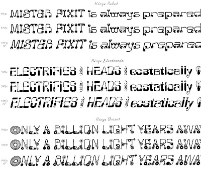
Here are the samples of Mike's typefaces from the Alphabet Thesaurus Vol. 3, A Treasury of Letter Design by Photo-Lettering Inc., 1971.
The typefaces were identified by name and number; the number was followed by a letter.
n = normal
c = compressed (stretched north and south)
e = expanded (stretched east and west)
Most were shown in italic at a 12 degree forward slant; a few had an outline sample.
Do you have the book, The Mars One Crew Manual? It was published here by Ballantine
Books in 1985. I designed it and hired Mike to do some technical drawings; the art credits
are on the copyright page. He also designed the patch on the cover; the art was by
another artist. If you can't find it, I might have an extra copy in my basement.
Onyx was represented in the periodical Design Quarterly. It's also in the basement.
Did Mike get a wage increase for his work in TDC XIII? I doubt it because his firm paid the
entry fee, and the hanging fee for the exhibition. Most likely he got a pat on the back, a
hearty congratulations and a copy of the award certificate.
Best,
On Mon, Aug 1, 2011 at 9:26 AM, Ivan Richards wrote:
Hi Alex
Thank you so much, a dream come true. It's really good to have the Plinc vol. 3 scans I will put them on Onyxcube blog for Mike's birthday. I had always wondered which book Mike's typefaces would be in. This book is worth a small fortune, along with your Director's Club Show catalogue. My favourites are Hinge Electronic and Hinge Quasar. The Quasar looks familiar I think that I might have an illustration in a book somewhere with this design.
I'd love to see the periodical Design Quarterly with the Onyx font. Do you know of any other fonts Mike designed? Some while ago I remember seeing a font rough design on ebay and didn't make a note or copy of it, which i always do now.
Yes I am lucky to already own a copy of The Mars One Crew Manual. It's very good and great design lovely and complex. There are masses of illustrations here, I wonder how long it might have taken to do? How long would it have taken for Mike to complete one of the large technical pictures? Would he have used photoraphs and traced? It is a nice book and hasn't yet been given enough attention on the web, it's on my list to post some images and info sometime soon.
(...)
Many thanks again
All the best
Ivan.
|
------
From: Alex Jay
Sent: 01 August 2011 20:08
To: Ivan Richards
Subject: Re: Mike Hinge Blog - thank you
Hi Ivan,
Attached is a scan of the cover of "Design Quarterly 78/79: A Special Double Issue on 'Conceptual Architecture'"; near the top of the cover, the letter is addressed to Onyx and others; near the bottom you'll see "ONYX (pages 42-46).
On page 44 Mike was represented by his Parsec City illustration of the space vehicle flying into the wall of circuits with the title, Parsec City, is in the upper right corner. I'm sure you've seen this illustration. On page 46 all four members of Onyx were represented; Mike's design is in the top right. This issue of DQ was perfect bound or square back; I did not want to crack the spine to get a better scan of Mike's design. I have no information on the other three members of Onyx, who had some background or interest in architecture. I'm not aware of a font, by Mike, called Onyx.
In the next email, I'll write more about the Mars One Crew Manual and related graphics.
Best,
Alex
From: Ivan Richards
Subject: Re: Mike Hinge Blog - Onyx group
To: Alex Jay
Date: Tuesday, 2 August, 2011, 13:20
Hi Alex,
Thank you very much, this Onyx group is very interesting. It is the first I have heard of it. Initially I thought you meant that Onyx was a typeface as I have a letterhead in my collection that has ONYX in an unusual green font and then a New York address, it's posted in my blog 119. I have made a quick search of the other members of Onyx but I think it will need a finer search to find them all. I wonder what other projects Onyx were involved with and if they had a manifesto, (...)
(...)
All the best
Ivan.
------
From: Alex Jay [mailto:alexjay10@gmail.com]
Sent: 02 August 2011 03:18
To: Ivan Richards
Subject: Mars One
Hi Ivan,
As I mentioned in an earlier email, Mike designed the Mars One patch which was rendered by another illustrator.
Attached are the alternate patch designs plus unused logos. Many of the logos were influenced by other fonts,
which he incorporated into the name. There were some exciting-looking logos but the editor and marketing head
at Ballantine Books wanted the cover to have some resemblance to the Space Shuttle book which was by the
same author. The Ballantine art director made the font selection for the cover.
The author supplied the technical drawings and most were used, as is, in the book. (There is a full-page photo
of the author, dressed in uniform, in the book. I cut out a press-proof of the patch and taped it to his uniform.) In
some cases the drawings needed to be modified and there's where Mike came in. I'd explain to Mike what the
author wanted in the new drawing and then we would go over the reference material and discuss what to do. He
took the material and returned in a few days or so with the finished illustrations. This was done over a period of
about four weeks.
I have a few photos of Mike, from November 2002, to share with you in the next email.
Best,
Alex
From: Ivan Richards
Sent: 03 August 2011 13:21
To: Alex Jay
Subject: Re: FW: Mars One
Hi Alex
Thank you very much, I wanted to first re look at my copy of Mars One, before replying. I had a good look again last night and have the copy here with me. It is such a clearly laid out book and with excellent notes crediting the art work. It has some great technical drawing from Mike (and you) with the occasional noticible Hinge style. With all the technical detail it might have been a joy for mike to do, there's a nice illo of a communication station 2.5.1 that has some buttons which he's used in other illustrations which is a nice continuity. The main computer console 6.1.1 looks amazing. Understandably the project didn't call for stylised drawings pity as i think it would be even more stunning. The drawings are they drawn large do the originals still exist?(...)
(...)
I look forward very much to seeing the photos of Mike.
All the very best
Ivan.
------
Date: Thu, Aug 4, 2011 at 1:49 AM
Subject: Re: FW: Mars One
To: Ivan Richards
Hi Ivan,
Photostats were made of Mike's original art. These photostats or line positives were pasted, along with the photo-typesetting of the text, on the mechanical. (These are terms from the pre-didgital age.) The original art was returned to Mike who always made a point of getting his art returned. I assume Mike stored the Mars One art with his other art. On this project I believe he did a few alternate drawings.
Back in November 2002, I invited Mike to spend the Thanksgiving weekend with my family, in-laws and my wife's relatives. I hadn't seen him for a few years so it was good to see him again. Actually, the last time I saw him was at my wedding back in 1994. The next day we travelled around the city; he always loved New York City and missed it very much. There are three photos of him at the World Financial Center which was across the street from what was the World Trade Center, which was now a construction pit. This was 14 months after the September 11 attack. In the photo of the palm trees, Mike is standing in front of the second row from the left. Debris from the Trade Center towers crashed through the atrium and badly damaged the area where Mike and the trees are standing. This area was rebuilt in about a year. The other two photos of Mike shows him standing in front of the large glass windows. At the time, this location offered the best view of the World Trade Center construction pit. The tall slender building next to Mike is a hotel which is on the east of the Trade Center. If I recall correctly, we went to the East Village and had lunch at an Indian restaurant, one of Mike's favorite cuisines.
(...) From the subway we walked to the street level and on to the bus station.
At the bus station we said our good-byes and that was the last time I saw him. Later, we talked a few times on the phone; one conversation was about a portrait he was working on of my wife. Then, in August 2003 I got a call from Larry Hama, who got a message from Jim Steranko, who was notified by Sandy Meschkow, about Mike's sudden passing.
Lastly, regarding the ONYX letterhead, I don't know if it was for Mike or the group. Mike told me he lived in the Chelsea neighbourhood which is on the west side of Manhattan. The address on the letterhead is an east side location.
Hope you enjoy the photos.
Best,
Alex