Showing posts with label Book Cover. Show all posts

Sunday, 6 November 2011

Mike Hinge - The Robot on the Algol Cover and a different view.

Mike Hinge A4 photocopy (From the  Mike Hinge photocopy collection)

I was delighted to see this image having had been so familiar with the striking Algol cover. It is from part of a collection of photocopies that Mike made of some of his work. We can now see the whole robot as if looking up from the reflection. A wonderful image as also the Algol cover. I wonder where and who owns the originals?

ALGOL: THE MAGAZINE ABOUT SCIENCE FICTION, Vol. 12 No. 2, Issue No. 24, Summer 1975

Tuesday, 9 August 2011

Mike Hinge 80th Anniversary: Andrew Porter

Andrew Porter first met Mike Hinge in the early 1960s, when he moved to NYC from Los Angeles, where he'd been a student at the Art Center School [now College] of Design. Andrew Porter was the editor and publisher of ALGOL, The Magazine About Science Fiction.

For the 80th Anniversary blog posts, Andrew has contributed a photograph of Mike, some covers from Algol and Starship and a rare prelim for the cover of Mediascene of Richard Dreyfuss in the film "Close Encounters of the Third Kind".

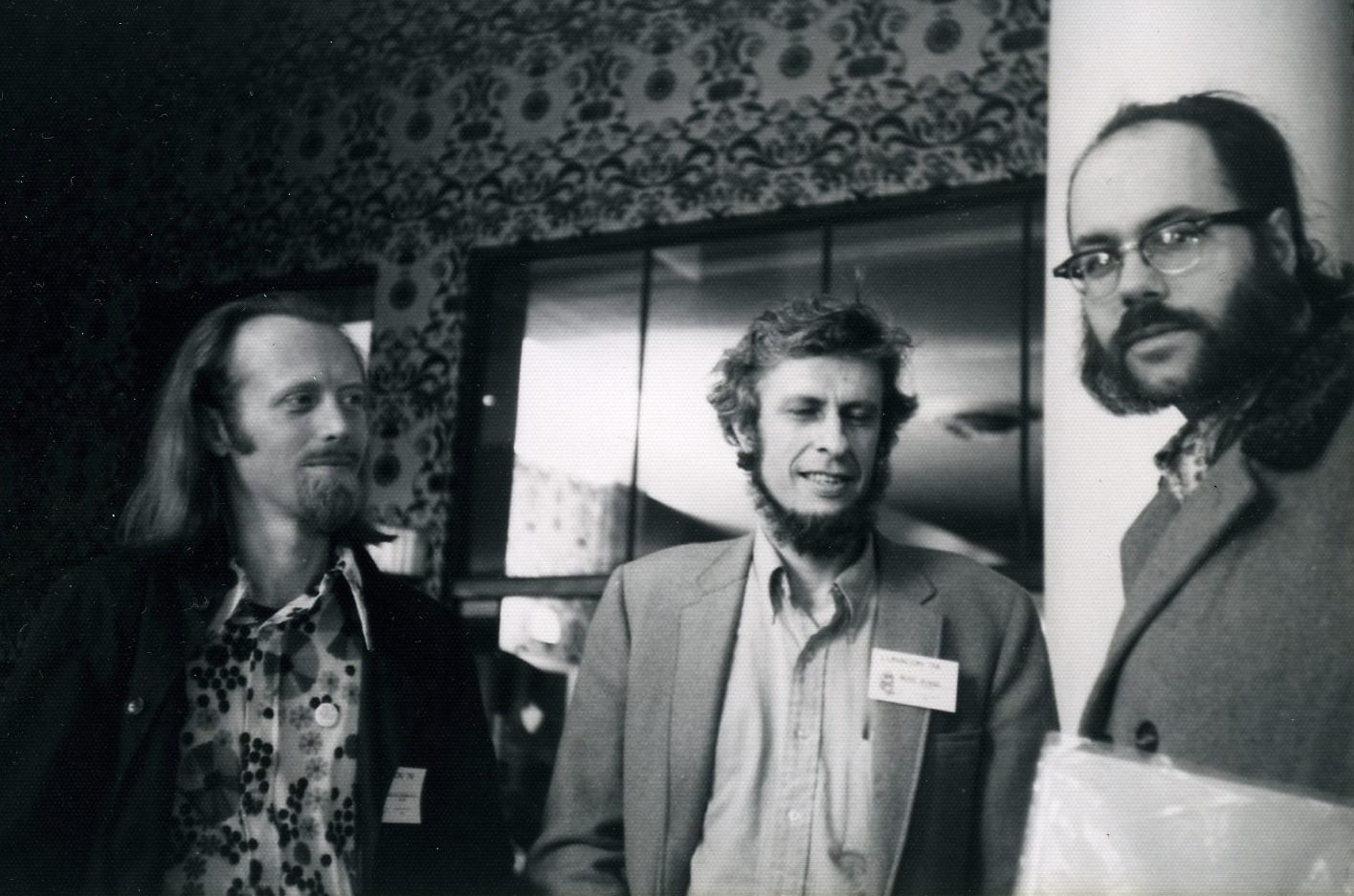
(L-R) Fred Von Bernewitz, Mike Hinge and Ted White, (1971 Lunacon possibly). Photograph by and © Andrew Porter


Rough of the cover for MEDIASCENE, The America New Magazine of Popular Entertainment, 1977

Cover of MEDIASCENE, section two, issue 28, Nov-Dec 1977

ALGOL: THE MAGAZINE ABOUT SCIENCE FICTION, Vol. 12 No. 2, Issue No. 24, Summer 1975
Andrew recalls that this cover was designed so that there were over-runs done without the logo which when folded made great Christmas cards.


Starship, The Magazine about Science Fiction (formerly ALGOL), Vol. 17 No. 2, Whole No. 38, Spring 1980


Saturday, 6 August 2011

Mike Hinge 120

This is an email I received from Sandy Meschkow, one of Mike Hinge's close friends, clarifying about where Mike lived before he died.

Dear Ivan,

   I think Mike fell out of direct communication with a lot of his New York contacts while he was in Philadelphia, so there is some confusion about where he was living after he left New York for Philadelphia. While he did spend the last few years of his life in a rented room just over the Philadelphia city line in Upper Darby, PA, he lived there alone. For about two years previous to that he lived with my wife, Marian, and I about ten miles west of Philadelphia in a little town called Havertown. In fact, the cover painting for George Allen Effinger’s novel, When Gravity Fails, was done in our back bedroom.

                                                                                                                                             Sandy Meschkow

 A3 photocopy of a prelim for the cover of George Allen Effinger’s novel, When Gravity Fails

Tuesday, 12 July 2011

Mike Hinge 119

Mike Hinge - The Carriage Trade. Approximate size 57x47cm. Date: Unknown. Unsigned.

I don't know what this might have been for? The name of a company or an album or perhaps it the name for the font? 

For the past few years I have been trying to track down the fonts that Mike designed. The Carriage Trade is perhaps not very typical (not very sci-fi) but then Mike's style is not always narrowed down to that genre. My last post had the front cover for the Lunacon 68 where it had what i'm sure is one of Mike's many typefaces, its his adaptation of a font called "Westminster" which was designed in the mid 6o's to be a machine readable typeface (Magnetic Ink Character Recognition or MICR) for the National Westminster Bank. There are many versions of this type face and I'm not sure if 1968 was the earliest time that Mike first used this but even so it is with out a doubt one of the first adaptations of Westminster. What I think makes Mike's typeface distinctive is the little tail on the end of the capital N & A and the large dot in the small i. Mike uses this font quite a lot in his work.

Another example of Mike's version of Westminster:

Android - A detail from the Mike Hinge Experience (1969-1973)

New York from about 1966 - 1969 Mike was an Art Director for Young & Rubicam and B.B.D.O (he could be in the tv series Mad Men), during this time I know that he won two awards at the 13th Annual Type Director's Club Show of 1967 (not be confused with Typography 13, by the Type Director's Club). What it was that he did for him to win two awards I don't know, I would really love to know. 

Mike produced several fonts for commercial reproduction and one of the type-houses that he worked with was a company called "Photo-Lettering Inc" or PLINC which were based in New York, established in 1936 closing in 1996. The 1000's of fonts held by PLINC have been locked away unseen and unused since, that is until now. Recently House Industries acquired the entire collection and have been taking care  of this amazing heritage and faithfully preserving the fonts, check out  PLINC's website.

At the moment there are not that many fonts on line but I am hopeful that we should see a few Hinge's sometime in the future. Here are a few fonts that I know were designed by Mike for PLINC: Hinge Computer, Electronic, Robot, Quasar, Integrated and Digital Readout. There are hopefully lots more and of those that I've listed I am not entirely sure what they look like.

Here are some more examples of Mike's typefaces below:

Monkey Wrench - From the collection of Mike Hinge's A4 photocopies date possibly late 60's


Earth Unaware (cover illustration) 1983, There's nothing to say that he designed the font as well but I think that he did and until I'm told otherwise... I remember reading somewhere that Ted White (editor of Amazing Stories, Fantastic...) said that Mike would not stop at just doing the illustration but would also want to have control on how the title was placed and would also want to design the typeface if he was allowed.


Archimedes - A detail from the Mike Hinge Experience (1969-1973)


Assignment in Tomorrow (cover illustration - printers proof) 1972.


Astarte - A detail from the Mike Hinge Experience (1969-1973)


Onyx (letterhead) -  From the collection of Mike Hinge's A4 photocopies date Unknown


No No Yes - A detail from the Mike Hinge Experience (1969-1973)


Shaggy Planet (cover illustration - printers proof) 1975.


Mexico Magnifico, Eastern Airlines, (One flyer and two tags) date unknown.

Mike Hinge (Logo) - date possibly 1980.


Tobacconist - - From the collection of Mike Hinge's A4 photocopies (traces of being touched up with tipex and pen) date unknown.

Hinge (Logo) - A detail from the Mike Hinge Experience (1969-1973)


Sunday, 26 June 2011

Mike Hinge 118

Mike Hinge, front cover wraparound for Lunacon 1968 program.

Whilst researching Mike Hinge I came accross Cecilia Cosentini a film maker in New York who had known Mike Hinge personally and was able to recall some interesting encounters which provide further insight on his personality. Cecilia kindly wrote this article specially for Onyxcube and I hope you will enjoy it. Thank you Cecilia!

Some links and history to Cecilia's work...

2003, Worked on the SciF Channel's Frank Herbert's Dune and Children of Dune which both won Emmy's for Special Effects.

1998 HBO's "From the Earth to the Moon" 12 part miniseries that got 17 Emmy Nominations (including one for special effects for the episode which she worked on),

1984 Interior illustrations for S. P Somtow's - Vampire Junction.

1978 Galaxy cover is found here.

1969 designed a Tarot Card for a Tarot Card project by Bruce Pelz that featured various artists. You can see it on this page here. It's the Lady of Swords which was one of the cards Bruce invented.


I was a long time reader of Science Fiction and grew up watching Star Trek. I was involved with SciFi fandom professionally from approximately 1975 to about 1985ish. During those years I attend Trek conventions and SciFi cons like Lunacon to sell my initial art experiments at the Art Shows.
There were also gatherings at Andrew Porter's home in Brooklyn, meetings at Stu Shiffman's in upper Manhattan and various other's: Devra Langsam of Spockanalia fame, "The Frog Palace" which was the home of Connor Cochran who in those days used his nickname, Freff (a contraction of FRiend jEFF) and Amy Sefton. The large home in Bensonhurst, Brooklyn was so named because of two cement frogs standing guard on either side of the staircase entrance. This was how artists, writers, editors and readers of SciFi networked. Somewhere in this melange of odd people, creative people and just plain nutty people I met Mike Hinge, but the exact occurrence is lost to the mists of Time. And I hope people reading this will recognize some names to help piece together more of the hinge puzzle. One of the first things that struck me is that he would sometimes sign his work with a drawing of a hinge. How clever, I thought!

In my 20's and at the start of my career I was totally focused on learning and figuring out where my talents really were. I was not mature enough to really appreciate Mike Hinge and his various interests and talents. I say this by way of apology because I wish I had more brilliant observations of Mike. Unfortunately, I was a dummy. 

However, I do recall one very important lesson. At the time publishing was a major source of income for artists. Even I had covers and interiors in Galaxy magazine (1978ish) and other publications. It was well known that most new artists are so desperate for work or acknowledgement that they will allow editors, agents and anyone to abuse them. One editor regularly screwed the artists out of their money. Editors and publishers would often keep or throw away an artists original work. The disrespect was amazing. And Mike was understandably bitter about this.
There were many subtleties when dealing with the Politics of Publishing and Mike showed me one. Generally (in those days, anyway) when you got a commission for an illustration you brought in several mock-ups and the editor chose the one they liked. I remember talking to Mike about this while looking over some of his work on a long table. He said he would make approximately five mock-ups, look them over and pick the "worse" one. He would set THAT one aside and bring the other best ones to show the editor. Mike knew that the editor would ALWAYS, Every Single Time love the worse image. He said this with some understandable disdain. (The look on his face could be translated to , "man, those guys are idiots") This was an important and revealing lesson. An artist should Always trust their own taste above everyone else's. You have to live with your decisions and what others do to your work. So, you don't give any opportunities for others to abuse you. You only show people work that you know you can be proud of. After all, it's your name on the page. Artists have to be responsible for their career.
And because of similar lessons I always made sure to get my original work back, to have editors sign a kill-fee contract and get the respect I deserve. 
When I look back I think I carried this outlook with me as I went on with my career in films and computers. 


Mike had many interests and one was music. Somehow I ended up going to a club with Mike. I don't know why the location of Columbus Circle in Manhattan pops into my head when I think of this, but I hope it's because it's near where this took place. I can see myself and Mike standing in a balcony area looking down at the band raucously and loudly playing. The crowded audience near the band were jumping up and down as if their feet were on fire. I later learned this was a "pogo". To say I was shocked is putting it mildly. I don't think I had seen anything so loud and so chaotic. I'm sure Mike was disappointed with my reaction, but it wasn't the first time and wouldn't be the last. Mike was WAY ahead of his time and I was too young to know it. When I was in my 30's I frequented CBGB's and throughly enjoyed Hardcore shows to the point where I was there every week at least. By then I had abandoned most of my scifi connections so I wasn't able to let Mike know I had finally SEEN THE LIGHT.


Mike was very much an "analog" artist, He knew how to pick up a pencil and draw. How to use a rapidograph pen, cut Screentones with exacto knives, design font faces, paint in gauche and probably knew various printing techniques like Silkscreen. I've noticed in my work in films that lots of "kids" seem to only have experience with their computers. I'm not saying there's anything wrong with "digital". I just think that an artist's work is influenced by the Many techniques they learn. I know that's been the case with me as MY analog experiences definitely affected my later digital work. Each technique adds an important point of view and understanding to all future work. Mike's sense of design was bold, unusual and beautiful. I wish someone had plumbed the depths of his brain about his influences and the process.

Yes, I do think Mike left a lasting impression on me. And it's shame more people don't know him and his work. I hope this small contribution helps remedy that unfortunate vacuum. And maybe looking at Mike's work we can, like archaeologists, begin to unearth the meaning.

Monday, 9 August 2010

Mike Hinge 064

HAPPY BIRTHDAY TO MIKE HINGE,
who would have been 79 today!!

A special post for Mike Hinge's Birthday to show some of his very best work. I have posted his first four Amazing Science Fiction covers and the original artwork from January 1973 (ASF). This idea was suggested to me by Neil who also owns the artwork and image below. 


This image was kindly sent to me by Neil 

January 1973
May 1972

November 1971
November 1970


Friday, 25 June 2010

Mike Hinge 018

Mike Hinge - front cover of "Amazing Science Fiction Stories" May/72, Illustrating "Other Days, Other Eyes" by Bob Shaw.

One day I'd like to put together a collection of front covers and interior illustrations in chronological order but for the time being...

Monday, 14 June 2010

Mike Hinge 006

The Mike Hinge Enterprise - I like to imagine that Mike Hinge was an eccentric, maverick entrepreneur dreaming up new projects and getting fired up with enthusiasm and working prolifically. I don't have much evidence that he was a driving ambitious entrepreneur but I believe that like most artist he wanted his work to be more widely known and he was indeed prolific in his work producing hundreds of illustrations and paintings. Through out his life he believed that artists should be paid well for their work and campaigned for such.

With Hinge's entrepreneur hat on he produced a collection of posters, possibly t-shirts, at least one fanzine and joined an art group and had various exhibitions of his work and of course had the legendary book the "The Mike Hinge Experience" that he produced with Jim Steranko's publishing company Supergraphics.

I think that there are certainly T-Shirts, Art Shows, Posters, Fanzines that Mike Hinge would have initiated and produced that I do not know about. The search continues...

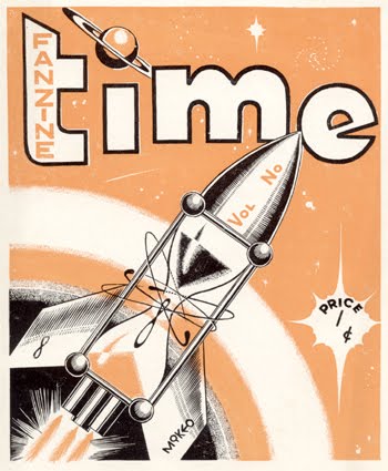
Fanzine - The only fanzine I know of, at this time, that Hinge produced, illustrated and wrote is called "Time" I have one copy and i believe that it was produced on or around July 1954 in New Zealand. It has writings including short stories and illustrations. Curiously he has signed one illustration as Michael B Hinge but the rest (6 more) are signed as Mikeo.


Posters - "Plug Into The Mike Hinge Electric Poster Trip". I only know of 7 posters that were produced and I have 3 of them. The three that i have come up quite regularly on ebay at the moment and are currently cheap as micro chips, get them if you haven't already! The Three that I have are "Area 5 Viewscreen", "Deck 4 Zero" & "Onyx Cube", i'd love to find the other 4 if anyone can help. Below is an advert advertising the posters from Algol magazine Summer 1975.


Art Shows - Hinge was involved with an artist group called "E. A. T." (Experiments in Art & Technology or... Engineers, Artists and Technology) the group was formed by engineers and artists alike including Robert Rauschenberg, Robert Whitman...I know very little about this group but I know that they had shows and Mike Hinge was involved and that Hinge also produced some electronic sculpture. I'd love to acquire more information on this arts group and to be able to acquire the catalogues and Hinges work from the shows.

T-Shirts - I have never seen a Hinge T-Shirt and at this moment where vintage T-shirts are all the fashion, i imagine that such an item would be extremely popular. Although I haven't seen a T-shirt I do have a design of one and it's called "Atom Heart Mother #2" and it is similar to an image which appears in the "Mike Hinge Experience" and the front cover of "Amazing Science Fiction" Dec/74. "Parsec T-shirts", wow! I'd love to see the other designs, this is the only one i have.

Hinge T-Shirt Design, "Atom Heart Mother #2", 3 ink colours on white paper. Date unknown. Approximately 40x70cm. unsigned.

Wednesday, 9 June 2010

Mike Hinge 001


The Mike Hinge Experience- cover

Get the "Mike Hinge Experience" it is an essential book and has some of Mike Hinge's best works!

About Mike Hinge