Showing posts with label Ron Williams. Show all posts

Sunday, 7 October 2012

Mike Hinge - ONYX (The ONYX Group)

The late sixties avant garde, counter culture art group ONYX, which Mike Hinge was a member along with founding members JW Rainey, Ron Williams, Tommy Simpson and Patrick Redson  amongst others, now at long last have a blog. See it here. This is exciting and I am looking forward to the journey. All the best.

Onyx (letterhead) -  From the collection of Mike Hinge's A4 photocopies date Unknown


Thursday, 14 June 2012

Mike Hinge - Remembered by Ron Williams

I have recently received an email from Ron Williams, architect, artist and author of Building and Flying Indoor Model Airplanes. Ron was a friend of Mike Hinge, they were together in the Onyx group and they also both worked for Donald Deskey Associates. I was thrilled to read Ron's valuable memories and I am very pleased to share his message here which I think is a wonderful insight into Mike's persona, life and work. I hope that you find it as fascinating as I have. A very big thank you to you Ron.  
--------------------------------------------------------------------------

Hi Ivan -
I Googled Mike Hinge last weekend and discovered your blog. It's terrific. I'm the Ron Williams referred to in the material about Mike and his involvement with the "ONYX" group. I can tell a bit about Mike and my friendship with him during the late 70s and early 80s. It was pretty intense as I'm sure anyone's encounter of Mike would be.
If I remember correctly, we met while we both worked for Donald Deskey Associates, the design firm. My background was in architecture and his, you know. ONYX was the getting together of Woody (J. Woodson) Rainey, Tommy Simpson, Mike and myself. There were many descriptions of what ONYX meant but largely it was an attempt to bring different sensibilities together and to resist the temptation to declare a manifesto. We published broadsheet/posters that we distributed to friends and colleagues and plastered on the walls of Manhattan's back streets. The name came from the definition of onyx as a many layered stone.
Woody Rainey has taught and practiced architecture in Manhattan since the late sixties. Tommy Simpson has made his way as an artist since I can remember, showing and selling his work all over the North East. Mike exhibited with us showing his art work and published a poster, the Parsec City. Tommy came into contact with us but I can’t remember if he did any specific work that he considered an ONYX project.
Woody did a mandala like calendar for an eight day week and other sheets displaying abstract architectural ideas. My work illustrated architectural projects involving fantasy designs exploring extreme spaces.
When I first met Mike he was living in a 1950s apartment building on West 16th Street just off 5th Avenue. He had a large studio apartment crammed with his work and ongoing projects. He was just beginning to explore electronic light sculptures and designing his type faces. The apartment was piled at least waist high with boxes and portfolios and with narrow passages between the collection to get to the facilities, the kitchen and Mike’s work area.
At the time one of Mike’s main preoccupations was with the state of his collected works and collections stored in Los Angeles. He had trunks and boxes stored in a warehouse there and was defaulting on his rent, in danger of losing it all. I’m not sure what happened to it but the experience would be repeated again and again. I would lose contact with him now and then and in the interim his life would seem to go through many changes though he kept up his work.
He moved to a loft on West 26th Street in Manhattan’s Flower district. The loft was high ceilinged and perhaps 30 by 80 feet. In a matter of months he had filled it with the voluminous material he managed to collect. He was a nightly dumpster diver and found a dumpster near a liquor store that threw out their empty liquor boxes nightly. He tried many different “brands” of boxes before he decided that J&B scotch whiskey boxes best served his needs. He labeled and stacked them, filled with material he figured would be useful or that he couldn’t resist collecting.
He collected giant glass jars that had held pickles and even larger brown plastic olive jars from delicatessens and restaurants. These too were carefully labeled to describe their contents - the variety of those contents was mind boggling.
Often, when wandering around Manhattan with him I would discover that I was “talking to no one” as Mike would disappear when he would see a promising piece of paper on the sidewalk or in the gutter and scoot away to retrieve it. He had receipts, ticket stubs, cigar bands, cigarette packages, every kind of small paper souvenir of someone’s encounter with the city. The J&B boxes were filled with beer cans, brands I’d wonder how he’d found in New York, from all over the world. His glass jars were filled with match books. Unless he had an appointment with someone and a schedule to meet it could take forever for him to get from one place to another. He could not resist stopping into random bars and restaurants to ask for a card and a book of matches. I never saw him drink but he sure had a lot of beers (an unopened full can was prized above all).
The last time I saw his loft, he had the same environment he had on 16th street but times 4 or 5. The stacks of green J&B boxes reached nearly to the ceiling and the aisles between the collections made the place seem more a library or very special warehouse than a home or studio.
We would wander into an out of each other’s lives periodically. I would bump into him and hear that he had lost his last place and that he was living in the studio of someone he was working for. Then he’d have a new place.
I drove Mike down to Reading, Pa once to visit a bunch of his comic/SF pals. He introduced me to Steranko; his followers had discovered the low rent residential area that beat out anything for hundreds of miles. Mike was always on the verge of poverty, living a life of feast or famine during the years we hung out. I think Pennsylvania became a back up for him as a cheap place to live after he saw how the Steranko crew had adapted.
During the late 70s or early 80s I introduced him to a bunch of artist friends that lived in the Tribeca area. They were pioneer lofties moving into and working in the area’s many loft spaces as SoHo became too gentrified. At a party at one of the lofts on a Halloween, if I remember correctly, he showed up with the night’s most outstanding woman and proceeded to give the entire assembly a lesson in dancing. The question of the night: “Who was that guy?”
Mike was quite secretive in many ways. I was surprised to learn of his age on this blog because that was a taboo subject when my friends and I knew him. New Zealand was as much as he would say about his past and nothing about the place at that. When he agonized over the loss of his collections in L. A. he would reveal as little as possible. Knowing how reluctant he was about his history, we would not press him but would tease him occasionally about his unknown age.
Mike rolled his own cigarettes. When someone mentioned that there were those that could roll two at a time he immediately gave an outstanding demonstration of the art.
His taste in music was universal except for one thing about which he was vehement: he could not stand voice. To him to sing was all but sinful and he would not hesitate to express his displeasure with the singer’s art. Opera was the last straw.
My friendship with Mike went dormant during the mid 80s as we both found new pursuits with which to engage. I had written and illustrated a book that was inspired by a short trip we took in 1976 when we visited an international model airplane meet at Lakehurst, New Jersey. Like many of the encounters and friendships one makes in Manhattan, we went our separate ways. The friends we had in common had all moved out of the city. I discovered that he’d died a few months after his passing and could not find much about him on the web. I often wondered what happened to the things he collected – they were attractive to him not as individual objects but as they represented areas of work, design and as a cumulative expression of life. If I had the money at the times his collections were threatened, and the sense to know how important they might be, I would have done more to help him keep them going. Too soon old, too late smart.
Your dedication to his memory is marvelous and he really deserves it. He was a truly unique human being and my life has been made all the richer for having known him.

Wednesday, 6 June 2012

Mike Hinge - and ONYX

What is Onyx? I remember when I first read about Onyx it was in a book "The New Visions A Collection Of Modern Science Fiction Art" published by Doubleday 1982. There was a short biography for Mike which I later found the full version here. In the biography it said  "Onyx display, Wittenborn bookstore" brief but intriguing. I concluded at the time that it was perhaps to do with Mike's set of 8 posters that I had started to collect and had seen advertised in Algol Magazine Summer 1975, one of the posters being called, Onyx Cube seen here in the original Algol advert . 

Over the next few months I would come across another references to Onyx and then one day Alex Jay sent me a scan of a magazine  "Design Quarterly 78/79: A Special Double Issue on 'Conceptual Architecture'", seen here and  it was then that I began to understand, Onyx was an artist collaboration. In that magazine it cited four members Ron Williams, Mike Hinge, Charles Albatross and Tom Simpson. With this lead, I searched on the internet and found an article in French entitled Mutations v.0.8 providing a tantalising description of Onyx. Below is a Google translation of that description: 

"ONYX group was born in New York in the late sixties. It was founded by architects that we know by the pseudonym they used at the time: Charles Albatross, Mr. & Mrs.. Harvey And The Grapefruit Orange, Patrick Redson, Okra Plantz, Tom Fulrey, Lili Piuschin, Mike Hinge, A'Lloyd. ONYX expressed their theories on architecture outside professional boundaries and conventional, through audiovisual performances and what we call a mail art. The posters of ONYX are perhaps the best examples of their operation shock, desecration of the concept of art and architecture at the time of their realization. Mail architecture was one of the instruments used to invent new ways of "doing" of architecture. Each poster was designed in every detail with great care, from graphic design to choice of colors (mostly two-color), passing through the text, often deliberately ironic and encrypted. The posters were produced in a limited number still. An advertisement stated that they were sold by mail ..."- see source: 

In October last year, Alex Jay sent me another set of exciting scans from a publication called Arthropods, published by Praeger 1972. This was a double bonus as it mentioned EAT (another art collaboration Mike had been involved with) and Onyx... However there were no Mike Hinge pictures, that didn't matter as the images were fantastic, mind blowing and I knew that this was a group that deserved much more attention. Here from the magazine are the images and text. Enjoy.


Daily Earth Chronicle by Ron Williams

The Rule by Woodson Rainey

The Rule by Woodson Rainey

The World Map by Woodson Rainey

The World Map by Woodson Rainey


??

It is all beginning to make sense now. Discovering Onyx group has shed a new light onto Mike Hinge's work. 
See more Onyx at the "Frac Centre" website.

Next week, stayed tuned, there will be a written article by Ron Williams of Onyx. With his first hand account of his involvement with the Onyx and memories of Mike Hinge.  


Tuesday, 9 August 2011

Mike Hinge 80th Anniversary: Alex Jay

Below is an edited version of e-mails exchanged between Alex Jay and myself. Alex is an artist and was a friend and colleague of Mike Hinge and kindly shared with me some interesting facts and images which shed some light into the breadth of Mike's creative work.

http://comicbookdb.com/creator.php?ID=6724
-----------------------------------------------------------------------------------------------------------

From: Alex Jay
Sent: 27 July 2011 13:53
To: Ivan Richards
Subject: Mike Hinge Blog

Hello Ivan, 

Sandy Meschkow told me about your blog and sent your email address to me.

I've known Mike since 1978 when I met him at Neal Adams' studio, Continuity Associates, in 
New York City; Mike rented a room there. I was invited to rent a space in 1980. My background 
was graphic design so we had a lot in common. I also did a fair number of comic book logos 
which can be seen at the Comic Book Database, comicbookdb.com/creator.php?ID=6724; click 
on the link for Machine Man and you'll see where Mike's Monkey Wrench typeface came from. 
I'll say more about it in another email.

Thank you for creating a blog about Mike and his designs. Most of it I've never seen because 
he had it in storage. Regarding your post #119, I can show you Mike's designs from the 13th 
Annual Type Director's Club Show (TDC XIII) of 1967; they were part of the ad campaign for 
Mexico Magnifico.  (click on images to enlarge)


Annual TDC XIII                                          Mike Hinge's winning ad for Mexico Magnifico


On Thu, Jul 28, 2011 at 7:15 AM, Ivan Richards  wrote:
Hi Alex
Thank you so much. This is fantastic information. It is really cool that you have the 13th Annual Type Director's Club Show catalogue and have scanned the pages, I would love to put the scans for blog. What a surprise, The Mexico Magnifico is familiar to me as I have two tags and a flyer with the design, I wonder if Mike got a wage raise for getting a prize?
(...)


All the very best
Ivan

------

From: Alex Jay
Sent: 28 July 2011 19:48
To: Ivan Richards
Subject: Re: Mike Hinge Blog

Hello Ivan, 

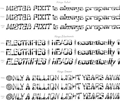
Here are the samples of Mike's typefaces from the Alphabet Thesaurus Vol. 3, A Treasury of Letter Design by Photo-Lettering Inc., 1971.

The typefaces were identified by name and number; the number was followed by a letter.
n = normal
c = compressed (stretched north and south)
e = expanded (stretched east and west)

Most were shown in italic at a 12 degree forward slant; a few had an outline sample.


Do you have the book, The Mars One Crew Manual? It was published here by Ballantine 
Books in 1985. I designed it and hired Mike to do some technical drawings; the art credits 
are on the copyright page. He also designed the patch on the cover; the art was by 
another artist. If you can't find it, I might have an extra copy in my basement.

Onyx was represented in the periodical Design Quarterly. It's also in the basement.

Did Mike get a wage increase for his work in TDC XIII? I doubt it because his firm paid the 
entry fee, and the hanging fee for the exhibition. Most likely he got a pat on the back, a 
hearty congratulations and a copy of the award certificate.

Best,
Alex


On Mon, Aug 1, 2011 at 9:26 AM, Ivan Richards  wrote:
Hi Alex
Thank you so much, a dream come true. It's really good to have the Plinc vol. 3 scans I will put them on Onyxcube blog for Mike's birthday. I had always wondered which book Mike's typefaces would be in. This book is worth a small fortune, along with your Director's Club Show catalogue. My favourites are Hinge Electronic and Hinge Quasar. The Quasar looks familiar I think that I might have an illustration in a book somewhere with this design.
I'd love to see the periodical Design Quarterly with the Onyx font. Do you know of any other fonts Mike designed? Some while ago I remember seeing a font rough design on ebay and didn't make a note or copy of it, which i always do now.
Yes I am lucky to already own a copy of The Mars One Crew Manual. It's very good and great design lovely and complex. There are masses of illustrations here, I wonder how long it might have taken to do? How long would it have taken for Mike to complete one of the large technical pictures? Would he have used photoraphs and traced? It is a nice book and hasn't yet been given enough attention on the web, it's on my list to post some images and info sometime soon.
(...)
Many thanks again
All the best
Ivan.

------
From: Alex Jay
Sent: 01 August 2011 20:08

To: Ivan Richards
Subject: Re: Mike Hinge Blog - thank you


Hi Ivan, 

Attached is a scan of the cover of "Design Quarterly 78/79: A Special Double Issue on 'Conceptual Architecture'"; near the top of the cover, the letter is addressed to Onyx and others; near the bottom you'll see "ONYX (pages 42-46).

On page 44 Mike was represented by his Parsec City illustration of the space vehicle flying into the wall of circuits with the title, Parsec City, is in the upper right corner. I'm sure you've seen this illustration. On page 46 all four members of Onyx were represented; Mike's design is in the top right. This issue of DQ was perfect bound or square back; I did not want to crack the spine to get a better scan of Mike's design. I have no information on the other three members of Onyx, who had some background or interest in architecture. I'm not aware of a font, by Mike, called Onyx.

In the next email, I'll write more about the Mars One Crew Manual and related graphics.

Best,
Alex


From: Ivan Richards
Subject: Re: Mike Hinge Blog - Onyx group
To: Alex Jay
Date: Tuesday, 2 August, 2011, 13:20

Hi Alex,
Thank you very much, this Onyx group is very interesting. It is the first I have heard of it. Initially I thought you meant that Onyx was a typeface as I have a letterhead in my collection that has ONYX in an unusual green font and then a New York address, it's posted in my blog 119. I have made a quick search of the other members of Onyx but I think it will need a finer search to find them all. I wonder what other projects Onyx were involved with and if they had a manifesto, (...)

(...)

All the best

Ivan.

------
From: Alex Jay [mailto:alexjay10@gmail.com] 
Sent: 02 August 2011 03:18
To: Ivan Richards
Subject: Mars One

Hi Ivan, 

As I mentioned in an earlier email, Mike designed the Mars One patch which was rendered by another illustrator. 
Attached are the alternate patch designs plus unused logos. Many of the logos were influenced by other fonts, 
which he incorporated into the name. There were some exciting-looking logos but the editor and marketing head 
at Ballantine Books wanted the cover to have some resemblance to the Space Shuttle book which was by the 
same author. The Ballantine art director made the font selection for the cover.

The author supplied the technical drawings and most were used, as is, in the book. (There is a full-page photo 
of the author, dressed in uniform, in the book. I cut out a press-proof of the patch and taped it to his uniform.) In 
some cases the drawings needed to be modified and there's where Mike came in. I'd explain to Mike what the
 author wanted in the new drawing and then we would go over the reference material and discuss what to do. He 
took the material and returned in a few days or so with the finished illustrations. This was done over a period of 
about four weeks.

I have a few photos of Mike, from November 2002, to share with you in the next email.

Best,
Alex


From: Ivan Richards
Sent: 03 August 2011 13:21
To: Alex Jay
Subject: Re: FW: Mars One

Hi Alex
Thank you very much, I wanted to first re look at my copy of Mars One, before replying. I had a good look again last night and have the copy here with me. It is such a clearly laid out book and with excellent notes crediting the art work. It has some great technical drawing from Mike (and you) with the occasional noticible Hinge style. With all the technical detail it might have been a joy for mike to do, there's a nice illo of a communication station 2.5.1 that has some buttons which he's used in other illustrations which is a nice continuity. The main computer console 6.1.1 looks amazing. Understandably the project didn't call for stylised drawings pity as i think it would be even more stunning. The drawings are they drawn large do the originals still exist?(...)

(...)

I look forward very much to seeing the photos of Mike.

All the very best

Ivan.

------
From: Alex Jay

Date: Thu, Aug 4, 2011 at 1:49 AM
Subject: Re: FW: Mars One
To: Ivan Richards

Hi Ivan,

Photostats were made of Mike's original art. These photostats or line positives were pasted, along with the photo-typesetting of the text, on the mechanical. (These are terms from the pre-didgital age.) The original art was returned to Mike who always made a point of getting his art returned. I assume Mike stored the Mars One art with his other art. On this project I believe he did a few alternate drawings.

Back in November 2002, I invited Mike to spend the Thanksgiving weekend with my family, in-laws and my wife's relatives. I hadn't seen him for a few years so it was good to see him again. Actually, the last time I saw him was at my wedding back  in 1994. The next day we travelled around the city; he always loved New York City and missed it very much. There are three photos of him at the World Financial Center which was across the street from what was the World Trade Center, which was now a construction pit. This was 14 months after the September 11 attack. In the photo of the palm trees, Mike is standing in front of the second row from the left. Debris from the Trade Center towers crashed through the atrium and badly damaged the area where Mike and the trees are standing. This area was rebuilt in about a year. The other two photos of Mike shows him standing in front of the large glass windows. At the time, this location offered the best view of the World Trade Center construction pit. The tall slender building next to Mike is a hotel which is on the east of the Trade Center. If I recall correctly, we went to the East Village and had lunch at an Indian restaurant, one of Mike's favorite cuisines.

The other group of photos were shot at the 42nd Street subway station at Times Square. Mike is standing under pop artist Roy Lichtenstein's mural. You can read more about it here, www.mta.info/mta/aft/permanentart/permart.html?agency=nyct&line=A&station=5&artist=1
(...)  From the subway we walked to the street level and on to the bus station.
At the bus station we said our good-byes and that was the last time I saw him. Later, we talked a few times on the phone; one conversation was about a portrait he was working on of my wife. Then, in August 2003 I got a call from Larry Hama, who got a message from Jim Steranko, who was notified by Sandy Meschkow, about Mike's sudden passing.

Lastly, regarding the ONYX letterhead, I don't know if it was for Mike or the group. Mike told me he lived in the Chelsea neighbourhood which is on the west side of Manhattan. The address on the letterhead is an east side location.

Hope you enjoy the photos.
Best,
Alex