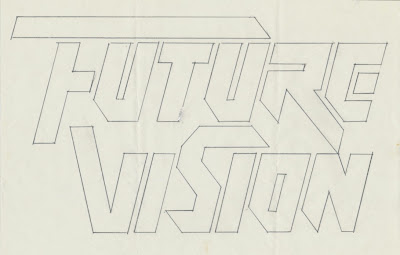
Alex Jay has kindly sent in some scans of some Logos that he & Mike produced in March 1990, for a new publishing company, Future
Visions, which focused on science fiction.
Alex told me that he and Mike worked independently on the project and says "We had to explore two solutions: a one-line version and a two-line version. It's a rather long logo on a single line; sometimes difficult to show large enough, say on the spine of book or game box or in a narrow advertisement".
"We made our presentation and the poor fellow couldn't decide on one. Later on we received a modest kill fee".
Choose your favourite I think you might agree that they are all pretty amazing.


the one labeled FV11.jpg and even the next one (FV12) is very good and readable (important factor). I can't see how anyone would have trouble deciding (rolls eyes).
ReplyDeletefor a oneline version either one on FV13 is perfect. I prefer the upper traveling line on the "V" to go to the right because that feels more forward rather that going to the left.
Frankly, I think there are just too many choices and isn't that one of the things Mike told me NOT to do with clients? hmmmmmm.
I wonder what the ones Mike rejected looked like - :)
Thanks Cecilia
ReplyDeleteI can see the eyes rolling. It's an interesting thought which ones Mike would have rejected and which ones he would have chose. Interesting choices you made too. My choice for the two liner is FV01 and my one liner FV13c... but then I might change my mind again later... : D